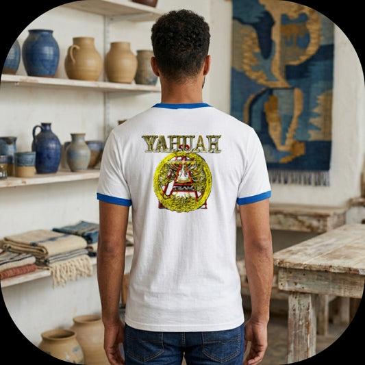
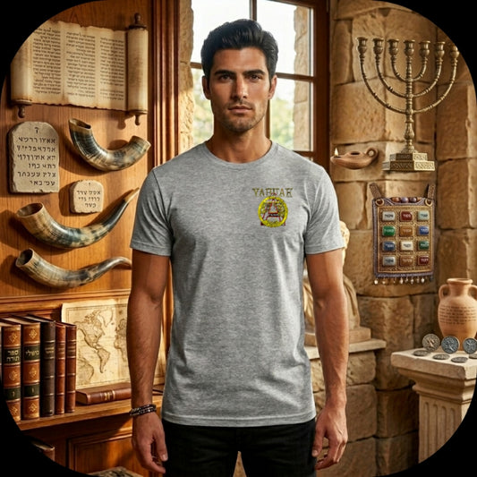
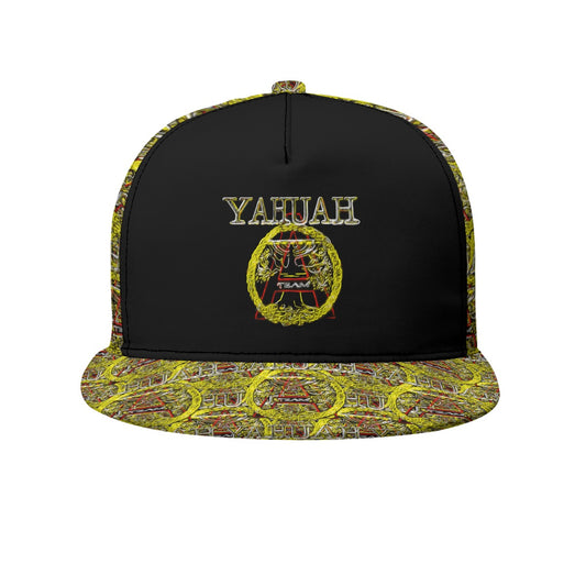
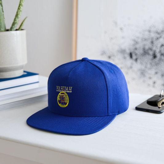
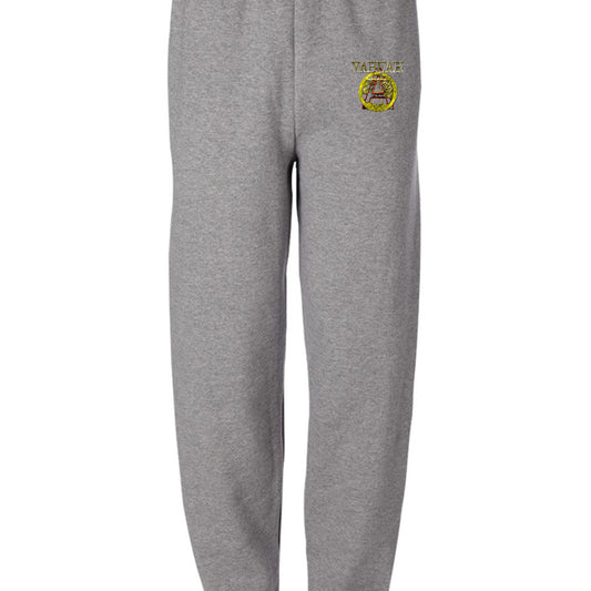
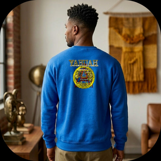
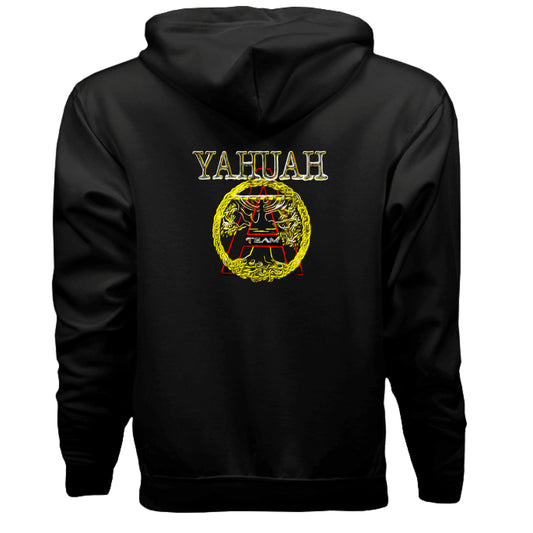
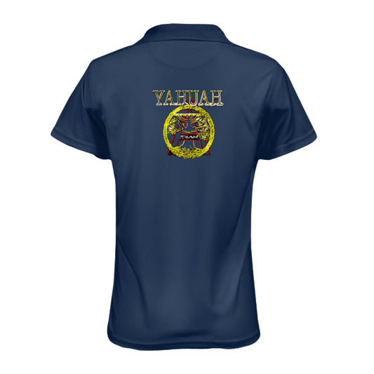
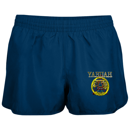
Design Overview
This design is rich with symbolic layers, seamlessly blending Hebrew religious concepts, tree-of-life motifs, and modern branding elements.
1. The Name "YAHUAH"
-
Placement: The name YAHUAH/YAHUWAH/YHWH (God) sits at the top of the design in a stylized, golden script.
-
Significance: It serves as a transliteration of the Tetragrammaton (YHWH), the four-letter Hebrew name of God.
-
Context: This specific spelling is used by the "Set-Apart" movement to emphasize the original, phonetic Hebrew pronunciation of the Creator's name, rejecting substituted titles like "Lord" or "God," as well as names they consider inaccurate (e.g., Yahweh, Yahawah, Yehovah).
-
Visual Treatment: The 3D gold texture signifies that the name itself is of the highest value—precious, eternal, and incorruptible.
2. Central Iconography
-
The Golden Tree: Enclosed in a circular wreath, this element represents the Tree of Life. In a Hebrew context, it symbolizes the Torah, wisdom, and the vital connection between the earthly and the divine.
-
The Red "A": Sitting prominently behind the tree, this stylized letter carries a dual meaning: it stands for Alpha or Aleph (the beginning) and "Abba" (Hebrew for "Father"). It highlights a direct, familial relationship with the Creator as the primary source.
-
The Circle/Wreath: The braided golden ring bounding the tree suggests eternity and the continuous, cyclical nature of life and the spirit.
3. The "TEAM" Motif
-
Placement & Meaning: The word "TEAM" is placed directly inside the letter "A," giving the design a modern, community-oriented feel.
-
Identity: It transforms the graphic from a simple theological statement into a badge of identity, implying unity, a shared mission, and a collective effort among a spiritual "tribe."
4. Aesthetic and Tone
-
Visual Style: The aesthetic utilizes neon-like outlines, a "glowing" effect, and high-contrast colors (gold, red, and silver on a black background).
-
Modern Vibe: This energetic and digital feel purposefully distances the design from traditional or "dusty" religious imagery, positioning the belief system as vibrant and highly relevant to the contemporary world.
5. Purpose and Application
-
Street Ministry: When used on apparel, the design acts as a deliberate conversation starter, prompting questions that allow the wearer to share their beliefs about the Hebrew origins of their faith.
-
Grafted-In Symbolism: The tree growing out of the "A" illustrates the New Testament metaphor (Romans 11) of followers of the Messiah Yahusha being "grafted in" to the olive tree of Israel, joining the original covenant.
Summary of Meaning
- Ultimately, this logo represents set-apart individuals—the "A-Team" of Yahuah.
- It serves as a badge of membership for a decentralized network of believers focused on Hebrew roots, the restoration of the divine name, and Torah-based practices.
- The imagery encapsulates a shared spiritual life, grounded in ancient traditions but expressed through a modern, communal framework.